
W E B S I T E + W O R K B O O K + B R A N D I D
The objective of this site is to explain and support BEBS: Building Equity-Based Summers – a series of learning modules to increase equity-based thinking when planning summer services at libraries. The site and its contents must be compliant with the California Gov Code Sections 7405, 1135, and 11546.7, and the WCAG 2.1 Level AA.
ux/ui design
information architecture
content strategy + creation
brand id + visual design
discovery sessions
WCAG accessibility compliance
Difficult conversations

Whenever the words “structural racism” and
”systemically marginalized” occur on the same page, people will start to squirm. The number one hurdle to knock down for BEBS was to create a safe space to have these conversations about equity work and how to get it done.
The design is not apologetic. It supports the heavy and serious content with equally bold visuals: a bright color palette; large typography; and crisp, round shapes. This is balanced with soft gradients and hand-drawn illustrations of positive and encouraging messages.
Inspired community

How do we convince a librarians and library staff the importance and worthiness of developing and evaluating their services with an equity-focused lens?
The easiest and and most impactful way was to leverage the library staff that had already gone through the sessions and could offer their enthusiasm and insights. The home page offers a community “quilt” of testimonials that encourages you to click and watch.
The ui design for testimonials is a patchwork quilt pattern to echo that we need to do equity work together; not alone. Accessible information

All state funded entities must comply to California laws on accessibility and nondiscrimination as well as pass the WCAG 2.1 Level AA requirements when publishing content online.
While the brunt of the work landed on the developers (Caffeine Interactive) to make the website compliant, I did my part on the UI design with a color, contrast, linework, clear typography and hierarchy, element spacing, and stillness.
Large typographic words were part of the overall look and feel of the ui but are not crucial to screen reader information. I M P A C T
Since 2023 website release: Workshops have successfully launched in 6 new states (WA, RI, OH, MD, ID, CT) for a total of 33 libraries, plus 15 more California libraries. // Funding to run workshops has been extended to 2025. // With user feedback, additional updates to come in 2024.
Design system
Favicon and wordmark

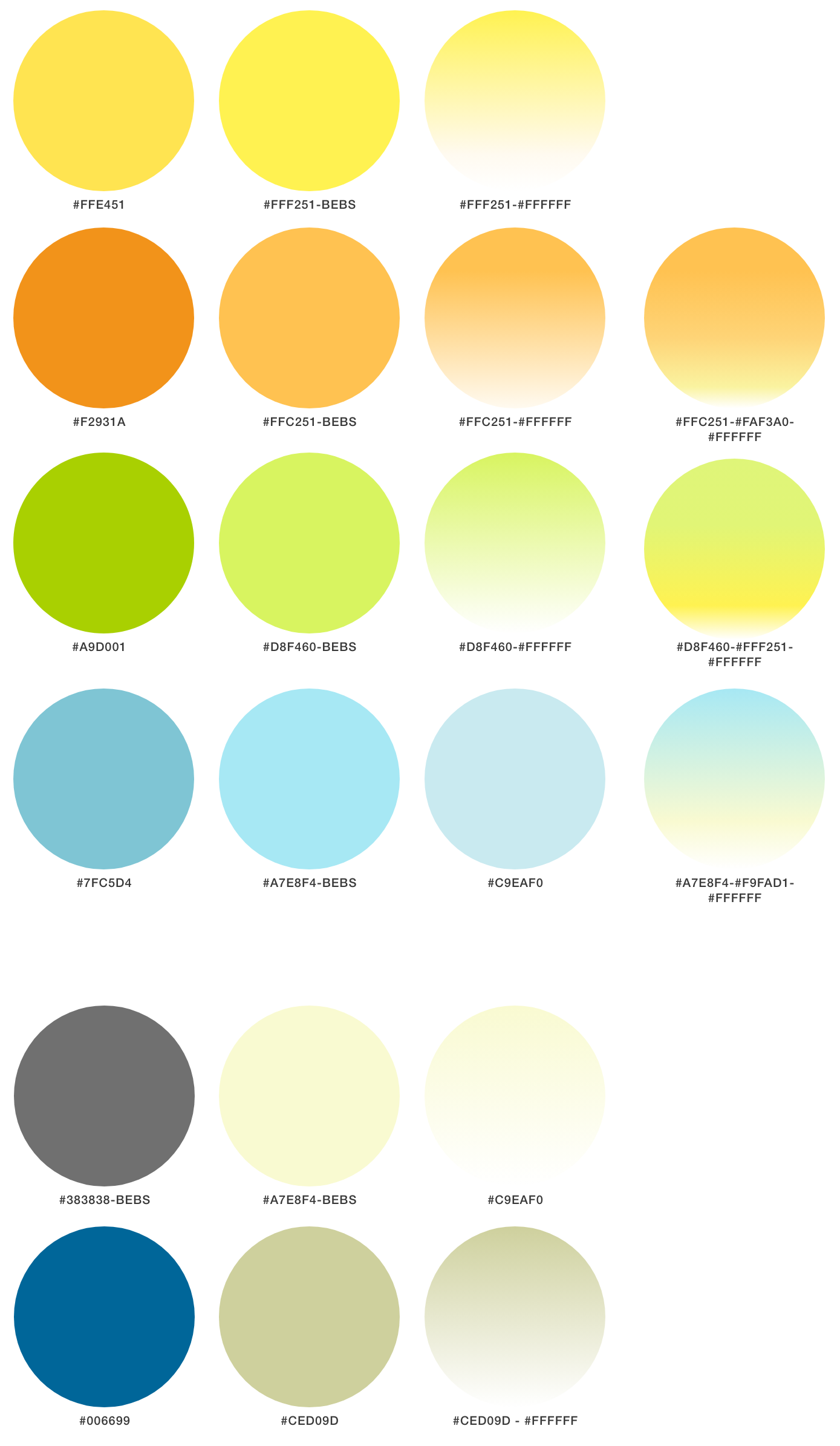
Primary color palette
Neutral color palette
Graphics:
large typographic words and phrases
These words and phrases were given alt text descriptions and are not crucial for the screen reader information.


Graphics:
friendly round shapes and hand-drawn illustrations

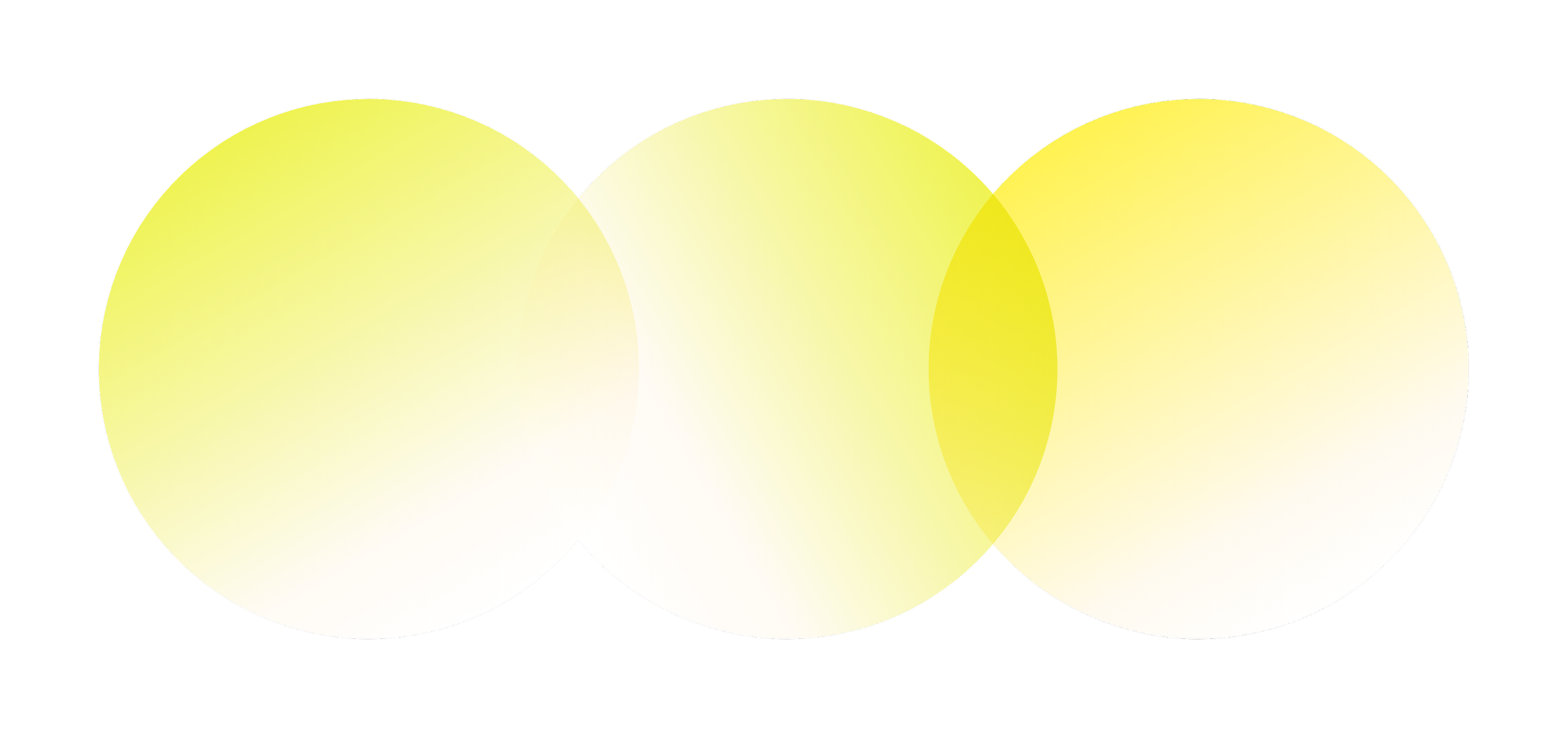


Hand-drawn style illustrations provide levity to a heavy topic and offer encouragement.

Equity work is hard! 


Photography style
To control the mixed bag of photos received from library staff, we converted them all to a high contrast, black and white and outlined them. 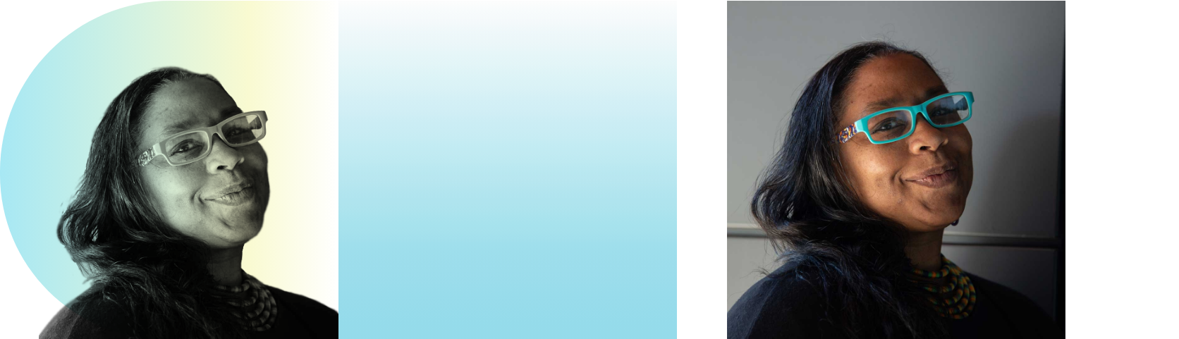
Original image

Original image
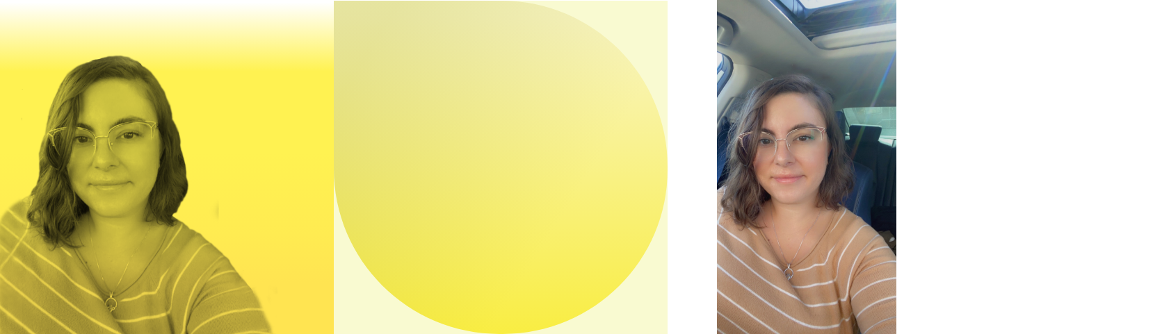
Original image
The images are part of the community "quilt" pattern. It has a simple rollover from a ghosted image to full color intensity to encourage exploration. R E F L E C T I O N
What I love about working with my client is that she involves me early before she has it all baked in her head. This allows me to provide new and different perspectives to inform the program and help fine tune it. It also affords me greater understanding of the big picture which is invaluable as I design the information architecture, functionality and details of the website.

F I N A L R E F L E C T I O N
I completely underestimated the herculean effort required to make the workbook PDFs WCAG 2.1 AA compliant. I’m still learning. // Even though the PDF and website passed compliance, testing by persons with disabilities is strongly recommended.
Usability updates

BEFORE
Participants read the quality principles and indicators but did not make the leap on how to use them in their equity work
Information lacked subheads labeling the principles and the indicators.
Paragraph form did not emphasize the interconnectivity of the principles

AFTER
A chart format made it easier to understand how the principles overlapped and how the indicators helped to guide the user towards being more equitable.
Added prompt to the indicators: "You're making progress if..."
"Equity" Principles and Indicators replaced "Quality" Principles and Indicators
Principles and indicators are clearly labeled