M O B I L E A P P
Dollars & Sense: This financial literacy app was conceived in my first class on human-centered design. It was a multi-layered project of learning-while-doing. Mis-stepping and starting over. Long hours and dense Miro boards. Sprinkled with a lot of ambiguity, and being ok with that. When I finally lifted my head to take a deep breath, I congratulated my three cohorts for accomplishing so much but realized this was just the “sampler menu” of human-centered design. We’d barely scratched the surface and still had so much more to learn.
[alert: long page]
inital research & interviews
user flows
information architecture
wireframes
visual design & branding
prototyping
user testing
documentation
Design question
How might we provide young adults with an easy and personalized way to increase their financial literacy and gain agency over their financial future?
Exploratory research confirmed that young adults entering the workforce lacked the knowledge to make informed financial decisions.* Only 20 states require it to graduate high school and even then, those who took a course were no more financially literate than those who had not.**
Be flexible
Insight: Everyone is at a different life phase when it comes to their personal finances. Everyone has different learning styles and relationships with money stemming from varied life events and learned priorities.
Design goal: FLEXIBILITY
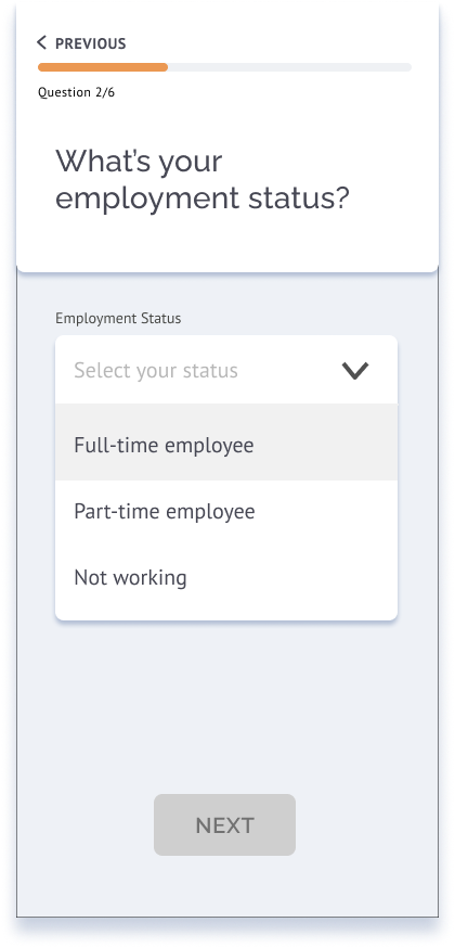
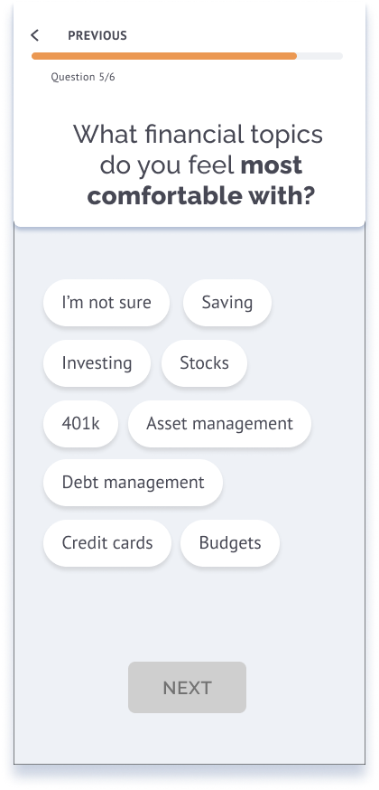
We allowed for flexibility as a user’s life and financial needs changed. We made onboarding easy with choices and preferences for a personalized starting point enabling the app to meet them where they are at.
Dollars & Sense has a light, modern feel. It includes lots of encouragement and builds trust through options and suggestions.
Visualize it
Insight: If young adults lack family or friends to guide them, they tend to seek out information via internet searches that become overwhelming and challenging to understand.
Design goal: VISUALIZE. ORGANIZE.
From the start, we wanted the app to be more visual with clear building blocks of learning, and appear approachable and game-like.
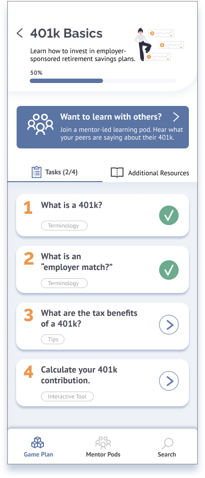
Dollars & Sense is organized into step-by-step learning blocks so the user can control the content and not get overwhelmed.
Connect
The young adults we spoke to wanted to know what their peers were doing and wanted to talk to a trusted source for financial information. Outside of family and friends, many young adults felt it was difficult to find a someone they could trust and were leery of white men in ties.
Design goal: CONNECT
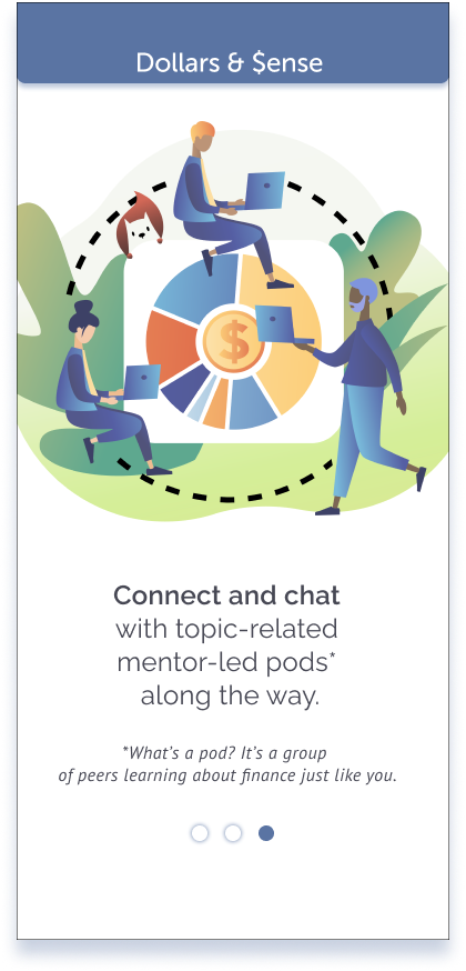
One of Dollars & Sense's key jobs-to-be-done connects users to peer-to-peer community support and financial mentors. A user can ask questions of peers and find mentors on topics to get relevant advice.
* A. Lusardi, O. S. Mitchell, V. Curto, Financial Literacy among the Young, Journal of Consumer Affairs Special Issue: Financial Literacy, 10.1111/j.1745-6606.2010.01173.x, 44, 2, (358-380), (2021). Wiley Online Library.
** Mandell, Lewis and Schmid Klein, Linda, The Impact of Financial Literacy Education on Subsequent Financial Behavior (2009). Journal of Financial Counseling and Planning, Vol. 20, No. 1, 2009, Available at SSRN: https://ssrn.com/abstract=2224231

One of the great things about working in a team is the variety of thinking and ways to solve a problem.
One of the worst things about working in a team is the variety of thinking and ways to solve a problem.
Some days we’d have so many paths to follow and so many ideas, it was hard to make a decision. So let’s break down what we did do…
Prototype mock-ups
GETTING STARTED: The onboarding questionnaire allows for personalization and an understanding of the life stage of the user.
Reflection: We realized the questionnaire could be a barrier to begin. We needed to add the option to explore the app without signing up.HOW TO GET THROUGH A GAME BLOCK: Your financial gameplan provides topics you selected and makes suggestions for you. It’s organized listing breaks down a complex topic into smaller, manageable chucks.
Reflection: Much of the gameboard-like quality was lost in our first prototype. We chose to wrap our heads around all the content and delivering it in a manageable mind-sized way.Interactive tools were important to understanding financial concepts such as this 401k slider. MENTOR PODS: This flow shows how to connect and find mentor pods and peers to learn about a specific topic.
Reflection: While the flow seemed intuitive to us, User research demonstrated confusion and uncertainty. Once we provided more clarity, this became a favorite feature. 
The images and gifs above are all the glam and sparkle of our digital prototype. The eight-week sprint included: initial research and insights (eight 1:1 interviews, online survey, competitive audits); a design statement (re-written 3x); three personas, two scenarios, and a partridge in a pear tree - ha, you’re still reading; design goals; information architecture, happy flows; ideation (brainstorming and sketching); wireframes and paper prototypes; user research and recommendations; a digital prototype; branding and visual design; specifications document; and a website.
For all the sweaty and gritty details, you can jump to a final project specifications document or keep on scrolling for the highlights. Or move on to the next project…
Research + insights
Initial research
We all contributed to every step. 75% of the way through we were drowning and realized this was not sustainable. We started to divide-and-conquer and trust each other to do quality work. THANK GOODNESS!Insights
Insight 2
A lack of financial structure and guidance leaves most young adults turning to internet searches for what they think they need to know.
Interviewees reported not knowing where to start and being overwhelmed with information, and they wanted more structured assistance to learn about finance.
70% of respondents currently rely on internet searches for financial advice.
Insight 1
Motivations and financial interests stem from life events and priorities. They learn it when they need to.
People are motivated and interested in seeking out resources to improve their financial literacy as it pertains and becomes relevant to their life events, priorities, and goals.
Insight 3
Target users want to know what their peers are doing. Those that do not lean on family or friends for advice, struggle to find reliable, understandable, and trustworthy information to support their financial decisions.
Current tools available don’t solve for our target user who is looking for guidance around where to start with broader financial literacy topics such as savings, budgets and 401ks.
There is an ongoing discussion on whether personas are worthwhile or not. In our case, we built these from the interviews and our survey. The quotations are real and Confused Cathy was our main target. Our personas kept us honest with our objectives and were filters for making decisions. It was surprising that 2 of the 10 we interviewed had experienced severe credit card debt and collection agency strife in their 20's.Personas
01
Provide the user with guidance to help them be prepared to manage their personal finances in a way that’s relevant to them
02
Provide a personalized plan based on the user’s values and perspectives about money
Design Requirements
03
Empower the user to make confident financial decisions
04
Provide a community and psychologically-safe environment that supports open discussion about financial topics
05
Be flexible to support various learning styles and levels of financial literacy
06
Connect users with trustworthy financial resources
Along with our Confused Cathy persona, these design requirements guided our decision making. Ideate + design
Concept Sketch: Game Blocks
This idea chunks out content into mind-sized bits of information so as to not overwhelm or intimidate. The game blocks allowed for customization meeting the users where they’re at in life.
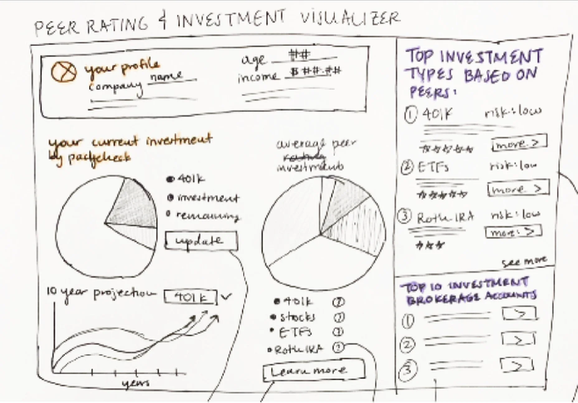
Concept Sketch: visualizing your money
An investment visualizer dashboard shows you how compound interest works for you. AND allows you to see what investment choices your peers are making.
Concept Sketch: finding someone to talk to
This idea introduced like-minded mentors and peers to have an open dialog about personal financing.
50+ sketches and concepts were generated among us. What if a box of chocolates could help you learn financial terminology? What about an assistant you could talk to like Alexa? In the end, we chose ideas that best addressed the top three insights from our initial research.IA and user flows
User Flow 1A and 1B
Creating and Editing Gameplan
User Flow 2
Completing a Gameplay Block
User Flow 3
Find/Join/Interact with a Mentor Pod
These flows were instrumental to understanding what screens and steps we needed to accomplish a task. Evaluate + iterate
User research was by far the most fascinating. What we thought was so intuitive was not. These are pages from the recommendations report. 
F I N A L R E F L E C T I O N S


